
The One Test UX Can Never Run: The Test of Time
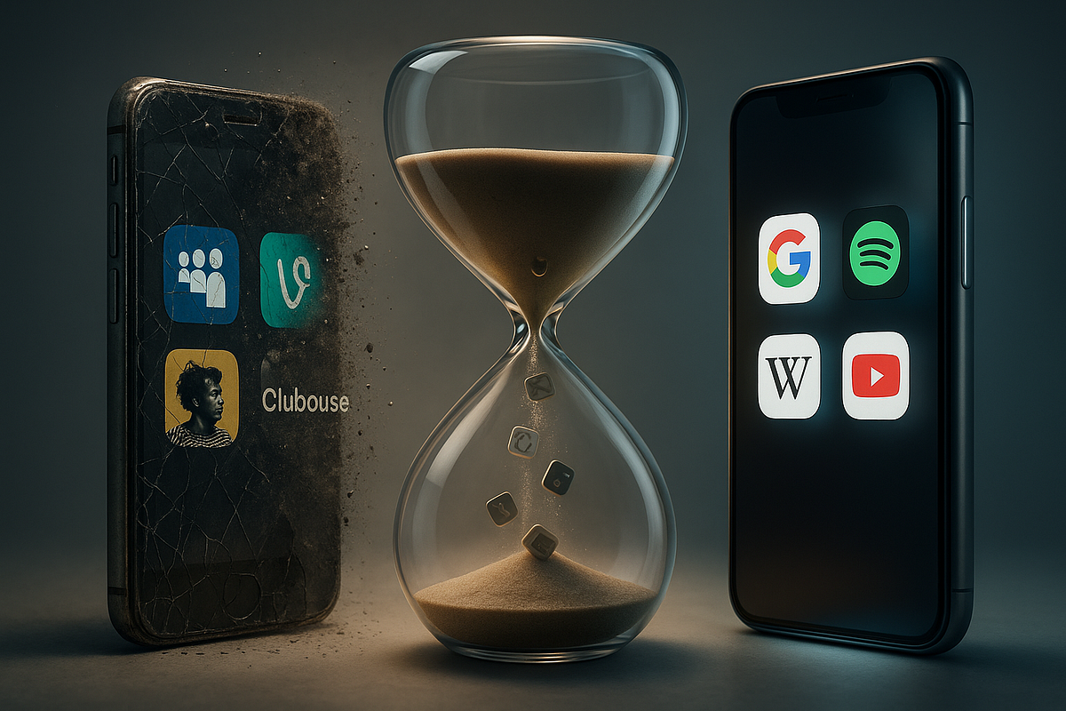
In UX, there’s one mantra we repeat almost religiously: “test everything.”
We prototype, we run usability studies, we do A/B testing, we track engagement metrics. Every step of the design process comes with an opportunity to validate our assumptions.
But there’s one test no one can run. Not me, not you, not even Google or Apple with all their resources.
It’s called the test of time.
Because no matter how smooth an interface feels today, no matter how polished a flow seems right now, the real question is: will it still feel relevant, trustworthy, and usable in 5 years? in 10?
And that’s the part of UX we can’t shortcut.
What does “the test of time” actually mean in UX?
When we say a product “stood the test of time,” we don’t just mean it’s still around. We mean it continues to deliver value despite:
• changing user behaviors,
• shifting cultural trends,
• new technologies and devices,
• evolving competition.
Positive example: Google Search. At its core, it’s been the same for over 20 years – one box, one button, instant results. The simplicity is almost boring, but that’s exactly why it works. It’s timeless.
Negative example: remember Clubhouse? At one point, everyone was talking about it. Audio-only conversations felt like the next big social movement. But as fast as it rose, it disappeared from most people’s phones. Why? It wasn’t designed to outlive the hype. It didn’t pass the test of time.
So, when we talk about time in UX, we’re really asking: is this design anchored in something durable, or is it just chasing today’s trends?
Why can’t we simulate the test of time?
Here’s the frustrating part: as UX designers, we love testing because it gives us control.
But time refuses to be tested. Why?
• We can’t predict social change. Think about how quickly remote work reshaped tools like Slack, Zoom, and Figma. No usability test in 2015 could’ve predicted that cultural shift.
• We can’t foresee technological leaps. A product built only for desktops in 2008 didn’t anticipate the mobile-first world we live in today.
• We can’t measure emotional trust in the long run. Trust builds slowly. A design that feels great on day one can still erode loyalty over years if the company abuses user trust.
Testing tells us what works now. Time reveals what lasts.
Lessons from products that stood the test of time
Let’s look at a few examples where design choices created longevity:
• Spotify. Its early focus wasn’t just music streaming – it was accessibility and personalization. Playlists, Discover Weekly, and a simple, green-black UI still hold up because they built on a timeless behavior: people want music that feels theirs.
• iPhone. Yes, the device has evolved massively. But the core UX of tapping icons on a home screen? It’s been there since 2007. That design pattern became a cultural standard.
• Wikipedia. No fancy UI, no radical redesigns. Just reliable, user-generated knowledge. It’s ugly to some, but it passed the test of time because the function outshines the form.
Now compare these with products that didn’t last: MySpace, Yahoo! Messenger, Google+. They all had initial hype but lacked long-term adaptability.
Designing with time in mind
If we can’t test time, what can we do? We can design in a way that anticipates it.
Some strategies I’ve seen work:
• Build systems, not just features. Features die; systems evolve. Think of Gmail’s ecosystem of search, labels, and filters. It’s flexible, not rigid.
• Invest in simplicity. Every extra layer of complexity is a debt against the future. Minimal flows survive better because they’re easier to adapt.
• Focus on trust and consistency. Users may forgive bugs, but if the product violates trust (e.g., selling data without transparency), it rarely recovers.
• Design for adaptability. Make things modular. Design tokens, scalable architectures, and patterns that can stretch without breaking.
Case in point: Figma didn’t become big overnight. But it was designed with collaboration at its core. When remote work skyrocketed, it was already prepared.
The paradox of timeless design
Here’s the tricky thing: designing for time often means resisting the temptation of novelty.
• Timeless design looks obvious in hindsight.
• It feels almost “boring” at launch compared to flashy trends.
• It focuses on clarity and trust, not on impressing in the short term.
And that’s a hard sell – both to stakeholders who want “innovation” and to designers who want to make something fresh. But in the long run, the boring design often wins.
Think about the London Underground map, designed in 1933 by Harry Beck. Clean lines, simple colors, non-geographical but universally understandable. It looked radical then, but it’s basically unchanged today. That’s timeless UX.
In UX, we can test almost everything: usability, desirability, accessibility, even emotional response. But the test of time is the one frontier we’ll never fully control.
What we can do is design responsibly:
• keep things simple,
• focus on trust,
• leave room for adaptation.
Because only users, years from now, will tell us if our design truly lasted.
👉 My question for you:
Which product in your life do you believe has truly passed the test of time – and why?
Thanks for reading — I’m on a journey to understand how AI is reshaping the way we design, build, and think about products.
I write to explore ideas, question assumptions, and spark better conversations.
What’s something this made you reflect on? I’d love to hear your perspective in the comments.
Comments (0)
Loading comments...